10 Costly Mistakes Designers Make When Building Android & iOS Components — and What to Do Instead
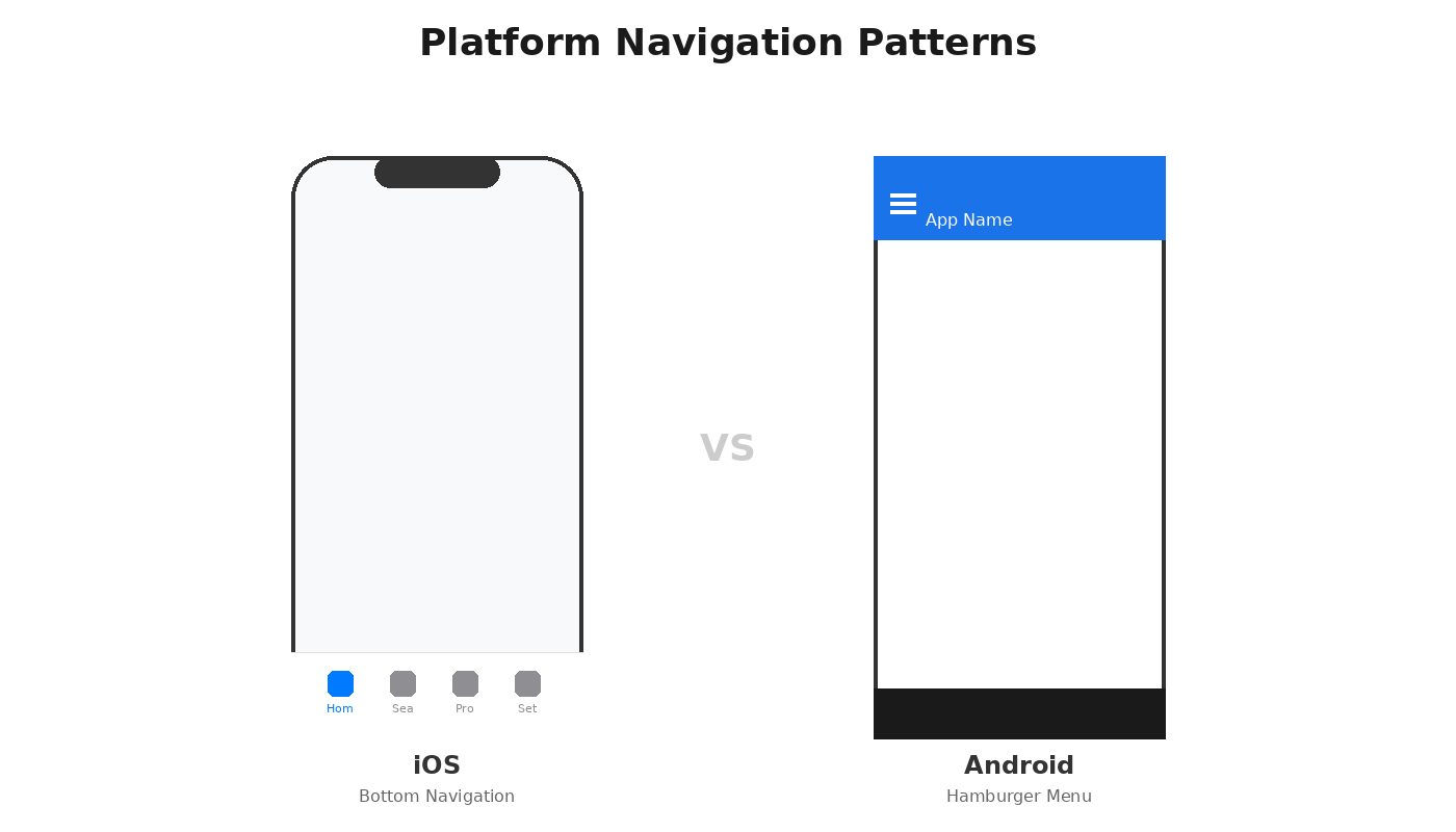
Designing for mobile isn’t about forcing one platform’s logic onto another — it’s about mastering each platform’s DNA to create experiences that feel intuitive, natural, and unmistakably native.
Yet many designers fall into the same traps: cloning iOS for Android (or vice versa) — forcing consistency where it doesn’t belong, and ignoring the tiny details that make each platform tick.
The result?
Apps that look familiar but feel awkward — like wearing someone else’s shoes.
I learned this the hard way watching a major ride-sharing app launch in 2019. The design team was iOS-heavy, so they designed everything iOS-first, then ported it to Android. Beautiful app. Horrible adoption.
Android users kept one-starring the app, complaining about “confusing navigation.” The problem? The team had copied iOS’s bottom tab bar instead of using Android’s familiar navigation drawer. Android users literally couldn’t find basic features because they were looking in the wrong place.
Three months and a complete navigation redesign later, their Android rating went from 2.8 to 4.6 stars. The components didn’t change.
The respect for platform patterns did.
In this article, we’ll break down the most common mistakes designers make when crafting Android and iOS components, and how to finally design like you mean it.
The 10 Mistakes:
1. Ignoring native platform patterns
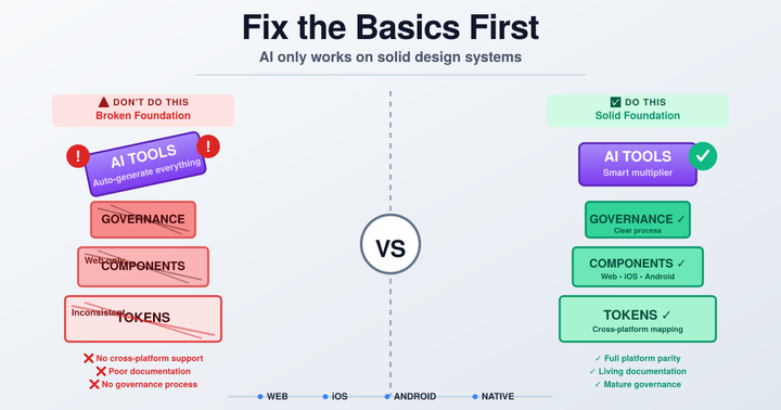
2. No shared design tokens across platforms
3. Skipping accessibility
4. Forgetting dark mode
5. Using pixels instead of design tokens
6. Ignoring touch interaction
7. Leaving motion to developers
8. Reinventing platform conventions without purpose
9. Never testing on real devices
10. Overcomplicating component libraries
Read on for details and how to fix each one.
1. Ignoring Native Patterns in Cross-Platform Design
Many designers fall into the trap of designing for one platform and then simply “porting” it to the other, assuming what works on iOS will work just as well on Android (or vice versa). It rarely does.
Why it’s a mistake
- Android and iOS follow fundamentally different design philosophies, navigation patterns, and interaction models. Material 3 (Android) and Liquid / Glass (iOS) each have distinct principles for motion, elevation, and responsiveness.
- Copying layouts, gestures, or animations from one platform to the other creates awkward, inconsistent experiences that feel foreign and frustrating to users.
How to fix it
- Design natively from the start: Follow Material 3 / Material 3 Express for Android and Human Interface Guidelines / Liquid Glass for iOS.
- Use platform-specific tokens: Define separate color, typography, and spacing tokens so each platform feels native while staying consistent.
- Respect native patterns: Gestures, animations, and interactions — swipe, drag, pull, and more — should feel natural to each OS. Mimicking the “other platform” makes your app feel awkward.
- Create distinct component libraries for each platform — Android, iOS, and Web — to respect their native interaction patterns and visual language. Consistency across platforms is important, but it should never come at the expense of user comfort or expectations.
By treating each platform uniquely and respecting its native patterns, your app will feel polished, intuitive, and truly “at home” on both Android and iOS.
2. Neglecting Platform Alignment Between Web, Android, and iOS
Many teams treat web, Android, and iOS as separate worlds, but users expect a seamless experience across all platforms.
Inconsistencies — whether in spacing, typography, colors, gestures, or interaction patterns — can confuse users, reduce trust, and make your product feel fragmented.
Even subtle differences in navigation, feedback, or motion can frustrate users who switch between devices.
Why it’s a mistake
- Users expect consistency. When web, Android, and iOS diverge too much, it breaks their mental model of the product.
- It creates friction for teams. Designers and developers spend extra time resolving inconsistencies rather than innovating.
- Reduces adoption and engagement. Users perceive the product as less polished or trustworthy.
How to fix it
- Define shared tokens and styles: Create a consistent set of design tokens, colors, typography, spacing, shadows — that can be applied across web, Android, and iOS, while allowing platform-specific adaptations.
- Implement adaptive layouts: Design responsive layouts that adjust gracefully to different screen sizes, orientations, and interaction patterns unique to each platform.
- Conduct cross-platform audits: Regularly review designs across web, Android, and iOS. Compare gestures, flows, components, and feedback patterns to identify discrepancies before they reach users.
- Document platform-specific adaptations: Clearly define where Android, iOS, and web intentionally differ, such as gestures, navigation patterns, and motion behavior, so teams understand which differences are purposeful.
By aligning web, Android, and iOS thoughtfully while sharing tokens and styles — you create a cohesive, intuitive experience across devices, build user trust, and reduce friction for your teams.
3. Ignoring Accessibility
Accessibility isn’t optional — it’s essential. Overlooking it can alienate users with disabilities, frustrate assistive technology users, and lead to non-compliance with legal standards (WCAG, ADA).
Each platform — web, Android, and iOS — has its own accessibility expectations, and ignoring these differences creates broken or confusing experiences.
Why it’s a mistake
- When accessibility isn’t designed intentionally, users who rely on assistive technologies, such as VoiceOver on iOS, TalkBack on Android, or screen readers on the web — face broken navigation, missing labels, and gestures that don’t work as expected.
- Developers often misimplement accessibility without clear specifications, resulting in apps that fail compliance and frustrate users.
- Accessibility issues reduce usability for all users, not just those with disabilities.
How to fix it — Platform-Specific Accessibility
iOS (VoiceOver)
- Ensure logical focus order and grouping of elements.
- Provide descriptive labels for buttons, images, and interactive components.
- Use Live Regions or hints to notify users of dynamic content updates.
- Annotate all behaviors clearly in Figma for developers.
Android (TalkBack)
- Ensure proper focus traversal for gestures.
- Add clear content descriptions for all interactive elements.
- Map custom gestures to standard accessibility gestures.
- Document all motion and interaction specifications in Figma.
Web (Screen Readers)
- Use semantic HTML, headings, ARIA roles, and landmarks.
- Ensure text contrast meets WCAG standards and interactive elements have visible focus states.
- Verify keyboard navigation works for all functionality.
Cross-platform best practices
- Shared tokens and scalable spacing: Use relative units (em, rem, dp) and dynamic type scaling for consistency across platforms.
- Accessibility annotations in Figma: Clearly indicate labels, focus order, gestures, motion, and Live Region behavior.
- Accessibility plugins for Figma: Tools like Stark, Able, and a11y — Figma Accessibility Toolkit help check contrast, simulate assistive technologies, and generate annotations.
- Accessibility kits: Leverage existing accessibility UI kits for guidelines for pre-annotated components and best practices (e.g. Microsoft Inclusive Design Figma Kit, Adobe Accessibility UI Kit, etc.)
- Testing: Validate designs with Apple’s Accessibility Inspector, Android’s Accessibility Scanner, and web screen readers.
Checklist for compliance
- Text contrast and color ratios
- Descriptive labels for interactive elements
- Correct focus/tab order
- Announcements for dynamic content
- Gesture accessibility per platform
- Assistive technology support (VoiceOver, TalkBack, screen readers)
Following these practices ensures a truly inclusive, native experience across web, Android, and iOS, reduces developer errors, and builds trust with all users.
BTW, accessibility is a lot of work. Partnering with an Inclusive Designer ensures accessibility is baked into your components from the start and meets best practices, allowing your designs to truly shine.
4. Forgetting Dark Mode
Dark mode is no longer optional — many users prefer it for battery savings, reduced eye strain, and better readability in low-light environments. Designing only for light mode can lead to poor visibility, inconsistent branding, and a frustrating user experience when the system switches to dark.
Why it’s a mistake
- Poor contrast: Text, icons, and UI elements designed only for light mode can become unreadable or cause eye strain in dark environments.
- Brand inconsistency: Colors that look vibrant in light mode may appear muted, harsh, or distorted in dark mode.
- Broken visual hierarchy: Shadows, highlights, and depth effects may not translate properly, making components feel flat or confusing.
- Platform-specific quirks: iOS and Android handle dark mode differently. For example, default system components, status bars, and adaptive colors behave differently across platforms. Ignoring these nuances can lead to a broken or inconsistent experience.
How to fix it
- Design for both modes from the start: Treat light and dark mode as equally important. Ensure all screens, components, icons, and typography adapt gracefully.
- Use system colors and adaptive tokens: Utilize system-defined colors and create tokens for dark and light variants. This ensures text, icons, and UI elements automatically adjust when the system theme changes.
- Maintain contrast and readability: Verify text, icons, and interactive elements meet accessibility contrast standards (WCAG AA/AAA) in both modes.
- Test across platforms: Check designs on both iOS and Android, as each OS may render shadows, transparency, and elevation differently in dark mode.
- Document color variants: Include light and dark mode specifications in your Figma libraries or component documentation to guide developers.
- Leverage tools and plugins: Plugins like Themer, Dark Mode Buddy, or Figma’s built-in color styles make it easier to preview and adjust designs for dark mode.
- Prototype in context: Test components in real dark environments or on devices set to dark mode to catch subtle readability or contrast issues.
Designing thoughtfully for dark mode ensures your product is usable, visually appealing, and consistent in every environment, while also reducing friction for developers implementing themes across platforms.
5. Using Pixel-Based Specifications Instead of Tokens
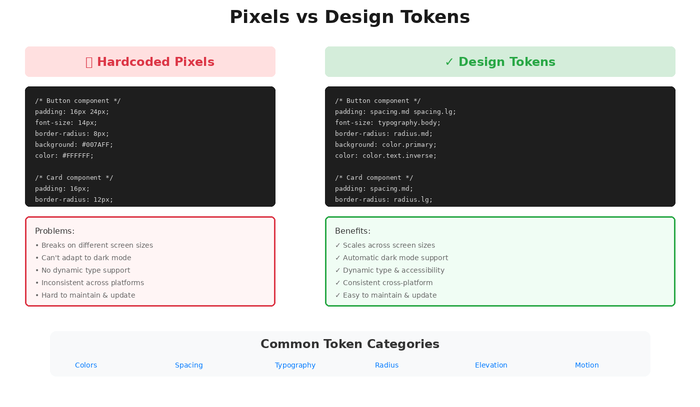
Pixel-based specifications (like padding: 24px) are outdated and inflexible. They don’t scale across devices, don’t support dynamic type, and make it harder to maintain consistency across platforms.
Why it’s a mistake
- Lack of scalability: Fixed pixel values break layouts on different screen sizes and resolutions.
- Poor responsiveness: Designs won’t adapt to dynamic type, accessibility settings, or device-specific scaling.
- Inconsistent cross-platform behavior: Android, iOS, and web handle sizing differently; using static pixels creates misalignment and developer headaches.
How to fix it
- Define design tokens: Create tokens for colors, typography, spacing, elevation, shadows, and border radii. Tokens provide a single source of truth for all screens and platforms.
- Use token-driven components: Apply tokens consistently across your Figma components to ensure layouts, text, and UI elements scale correctly.
- Employ relative units: Use dp (density-independent pixels) for Android, pt (points) for iOS, and em/rem for web. This ensures designs adapt to different devices, screen densities, and user settings.
- Leverage token management tools:
Figma Variables -ideal for managing tokens natively within Figma and synchronizing properties like colors, typography, and spacing.
Figma Tokens Studio — a powerful plugin for teams managing large-scale design systems or integrating tokens into development pipelines (supports JSON export and multi-brand design).
- Plan for dynamic type and accessibility: Tokens make it easier to implement responsive typography and spacing that respect user preferences for larger text or zoomed interfaces.
Using tokens instead of pixels ensures your designs are scalable, maintainable, and platform-ready, reducing developer friction and creating consistent experiences across devices.
6. Neglecting Touch Interaction
Mobile isn’t mouse-driven — it’s all about touch, gestures, and haptic feedback. Ignoring these fundamentals can lead to interfaces that are frustrating, confusing, or hard to navigate.
Why it’s a mistake
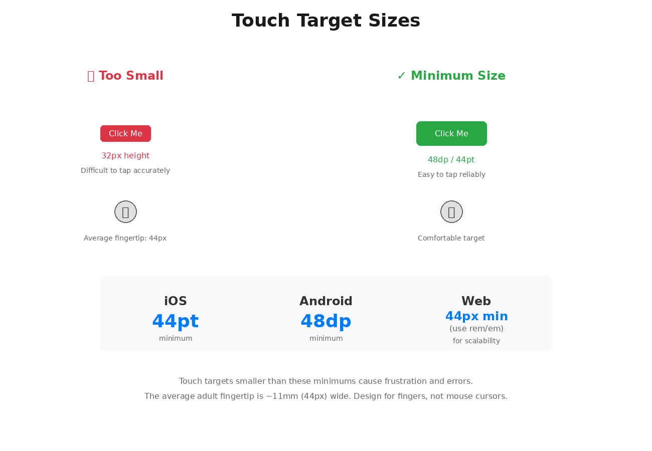
- Small or cramped touch targets: Buttons, icons, and interactive elements that are too small or too close together frustrate users.
- Unintuitive gestures: Swipe, long-press, drag, and pinch actions may not behave as expected if not designed for the platform.
- Missing feedback: Lack of haptic or tactile cues can make interactions feel flat or unresponsive.
- Platform differences: iOS and Android handle touch gestures, swipe behavior, and gesture recognition differently. Failing to respect these nuances creates inconsistent experiences.
How to fix it
- Respect minimum touch targets:
iOS: at least 44x44 pt
Android: at least 48x48 dp
- Design and test gestures: Ensure tap, swipe, pinch, long-press, and drag interactions feel natural and platform-native.
- Implement haptic feedback: Use subtle vibrations or tactile cues to confirm interactions, enhancing usability and delight.
- Test on real devices: Don’t rely only on Figma or emulators — real device testing helps catch touch responsiveness issues.
- Document in Figma: Annotate gestures, interactions, and feedback for developers to ensure accurate implementation.
By designing with touch-first principles, respecting platform-specific gestures, and including haptic feedback, your app feels intuitive, responsive, and delightful to users.
7. Neglecting Motion and Animation
Why it’s a mistake
Animations aren’t just decorative — they are a critical part of the user experience. They communicate hierarchy, indicate state changes, guide attention, and provide feedback for user actions.
Many designers deliver static components and leave motion entirely to engineers, assuming they will “figure it out.”
This often results in transitions that feel clunky, inconsistent, or confusing, breaking the user’s sense of flow and making even familiar interactions feel unnatural.
Ignoring motion can also reduce the perceived polish of your product.
Users subconsciously rely on consistent and intuitive animations to understand relationships between elements, recognize affordances, and feel confident in their actions. Without thoughtful motion design, apps can feel flat, disjointed, and frustrating.
How to fix it
- Document micro-interactions and gestures: Include hover states, taps, swipes, transitions, and other motion specifications in your component library. Clear documentation ensures designers and engineers are aligned on timing, easing, and behavior.
- Test on real devices: Simulators rarely capture the subtle feel of touch interactions, timing, or performance. Validate animations on multiple devices to ensure they feel smooth, responsive, and natural.
- Use motion to communicate hierarchy and guide attention: For example, subtle easing can indicate a modal appearing above content, or a scaling animation can highlight a primary action. Motion should serve a purpose, not just decorate the interface.
- Maintain consistency: Ensure similar components behave consistently across the app. Consistent motion patterns build familiarity and reduce cognitive load.
- Iterate based on feedback: Watch users interact with animated elements during usability testing. Refine timing, responsiveness, and gestures to match real-world expectations.
By designing motion intentionally rather than leaving it to chance, you create experiences that are not only beautiful but also intuitive, cohesive, and enjoyable to use.
8. Ignoring Platform Conventions or Reinventing Them Without Purpose
Users rely on familiar navigation patterns, gestures, and control behaviors. Ignoring these conventions — or reinventing them just to be different — creates confusion, slows task completion, and makes your app feel foreign. Mobile users have learned certain interactions on each platform, and breaking those expectations erodes trust and usability.
Why it’s a mistake:
- Breaks user expectations: Users expect standard patterns like bottom tab bars on iOS, navigation drawers on Android, and swipe-to-go-back gestures. Deviating too far makes your app harder to learn.
- Creates inconsistency across platforms: A navigation pattern that feels native on iOS may feel clunky on Android, leading to friction and lower adoption.
- Increases cognitive load: Users must relearn basic actions, which reduces efficiency and satisfaction.
- Causes developer friction: Custom or inconsistent patterns add extra implementation effort and increase the risk of bugs.
How to fix it:
- Follow platform guidelines:
Android: Material 3 principles for navigation, gestures, and back-stack behaviors.
iOS: Human Interface Guidelines (HIG) for controls, gestures, and hierarchies.
- Deviate thoughtfully: Introduce custom interactions only when they solve a real usability problem or add measurable value.
- Validate with usability testing: Test deviations with real users to ensure they feel intuitive on each platform.
- Leverage native affordances: Combine custom patterns with familiar cues (gestures, icons, motion) to maintain clarity.
- Document in Figma: Annotate navigation behaviors, gestures, and interactions clearly for developers to reduce misinterpretation.
- Maintain consistency: Even if you innovate, keep patterns predictable within your product.
By respecting platform conventions — and innovating only where it enhances usability — you create apps that feel native, intuitive, and effortless to use across both Android and iOS.
9. Failing to Test on Real Devices
Designing solely in simulators or emulators is risky. While these tools are helpful for initial layouts, they cannot replicate the nuances of real-world conditions — touch responsiveness, performance variations, accessibility behaviors, and display differences can all break the user experience if left untested.
Why it’s a mistake
- Device and OS variations: Screen sizes, resolutions, pixel densities, and aspect ratios differ across Android, iOS, and web devices. Designs may look perfect in a simulator but misalign or clip on real devices.
- Performance issues: Animations, transitions, and gesture handling can feel laggy or stutter in real-world usage, affecting perceived quality.
- Accessibility gaps: Screen readers (VoiceOver, TalkBack), dynamic type, and dark mode behaviors may not render accurately in simulation.
- Gesture and touch inconsistencies: Swipe, drag, pinch, and long-press interactions can behave differently in hand than on a mouse-driven interface.
- Unanticipated user behavior: Users may interact with the app in ways simulators don’t replicate, uncovering usability issues that were missed.
How to fix it
- Test on multiple devices: Check your app on different screen sizes, resolutions, and OS versions (Android and iOS). Include phones and tablets if relevant.
- Validate interactions: Test all gestures, tap targets, drag/drop, and haptic feedback on real devices to ensure responsiveness and usability.
- Check accessibility: Verify VoiceOver, TalkBack, dynamic type, and contrast settings directly on devices, and ensure accessibility annotations are implemented correctly.
- Evaluate dark mode and theming: Confirm that colors, contrast, and UI components look correct in both light and dark modes across platforms.
- Gather real user feedback: Conduct usability testing with actual users to uncover issues that simulators cannot predict.
- Iterate and document: Capture observations and update Figma annotations or developer handoff notes for accurate implementation.
Testing on real devices ensures your design is practical, usable, and delightful, reducing errors, improving adoption, and preventing frustrating surprises post-launch.
10. Overcomplicating Component Libraries
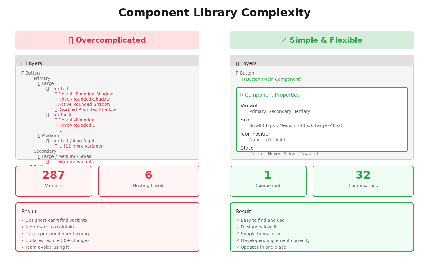
A bloated or overly rigid component library may seem thorough, but it often slows down designers and developers, reduces adoption, and increases maintenance headaches.
When components are too granular, hard to understand, or difficult to customize, teams spend more time figuring out how to use them than actually building products.
Why it’s a mistake
- Steep learning curve: Complex, nested, or overly detailed components confuse new users of the system.
- Reduced adoption: Designers may bypass the library entirely, creating inconsistent UI patterns across screens.
- Developer friction: Rigid components can be difficult to implement or customize, increasing handoff errors and technical debt.
- Slower iteration: Updating one overly complex component can require changes in multiple places, making iteration cumbersome.
- Maintenance overhead: The more intricate the library, the harder it is to keep tokens, variants, and documentation in sync.
How to fix it
- Build scalable and flexible components: Focus on modular design that balances reuse with adaptability. Avoid over-specifying variations unless truly necessary.
- Provide clear usage guidelines: Include not just visual specs, but instructions on when and how to use components, do’s and don’ts, accessibility considerations, and responsive behavior.
- Leverage Figma features: Use Auto Layout, Component Properties, Variants, Slots, and Dev Mode to improve usability, consistency, and maintainability.
- Document patterns and relationships: Clearly annotate how components connect, which tokens they rely on, and best practices for platform-specific variations.
- Stay updated: Continuously evolve your library by adopting the latest tools, plugins, and best Figma practices
- Collaborate with teams: Gather feedback from designers, developers, and product managers to refine components and ensure they serve real-world workflows.
A well-structured, flexible component library empowers teams, accelerates design and development, reduces errors, and ensures a consistent, scalable experience across platforms.
Overcomplication is the enemy of adoption.
Simplicity and clarity are your friends.
Final Thoughts
Your mobile components will be judged by how they feel, not just how they look.
The difference between a component library that gets ignored and one that gets adopted comes down to respecting platform DNA, making accessibility non-negotiable, and testing relentlessly on real devices.
**Quick audit checklist:**
- [ ] Do components follow platform-native patterns?
- [ ] Are design tokens defined for all platforms?
- [ ] Is accessibility tested with VoiceOver/TalkBack?
- [ ] Does dark mode work properly?
- [ ] Are touch targets minimum 44pt/48dp?
- [ ] Is motion documented with timing and easing?
- [ ] Have you tested on 3+ real devices?
Start with the items you answered “no” to.
Your users (and your team) will thank you.


Comments ()